

As an expansion team with roots tied directly to a movie from the 1990s, the Anaheim Ducks have had their share of unique looks and some of those looks have stood out, but for the wrong reasons. With the recent announcement from the NHL about the upcoming "Hometown Remix" jerseys for the 2026-27 season and the Ducks rumor mill churning out concepts for an adaptation of the original Mighty Ducks movie jersey with a modern flair, that would be undoubtedly be better than some of these looks from years past, now would be a good time to take a look back at some of the worst looks in franchise history. Note that this ranking is entirely subjective; what we don't like is not necessarily what you don't like and vice versa. Practice/warmup jerseys do not count either. And in lieu of breaking down the minute details from year over year variations, we are going to lump jerseys into certain eras, when applicable. Let's dive in.
5. The original "Wild Wing"
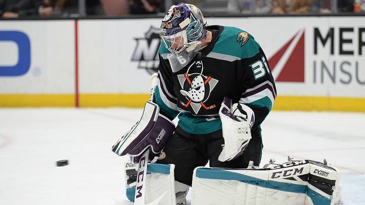
The first third jersey ever worn by the Mighty Ducks, leaned heavily into the cartoonish nature of the Wild Wing mascot, with the character featured prominently on the chest, breaking through a sheet of ice. Where the reverse retro design of 2021 rightfully used white as a base color, the original version opted for jade as the main color, further muddying the concept. The use of the Mistral font and arched nameplates on the back of the jersey was a good idea in theory, but the real-world application made the names and numbers of players difficult to read. In short, unique ideas, but horrible execution.

4. The third and fourth jerseys from the late 90s
Lesson 101 in how to take a beloved jersey design and make it worse. Part of the success from the original Mighty Ducks jersey designs was the diagonal striping to create a divide between juxtaposing color pallets. The alternates from the late 90s borrowed from that concept and applied the division along the shoulders instead. And what's worse than one bad alternate? Making two of them, home and away versions.

3. The webbed "D"
The Ducks spent the better part of 14 seasons with the webbed "D" as a primary logo. The thought process behind the concept was understandable, as the Samuelis were still trying to distance themselves from the Disney past and put their own mark on the franchise. With the wordmark design abandoned, but wanting to retain a darker pallet with a hint of orange, the webbed "D" felt like a half measure and one step short of establishing a unique identity though. Whereas the Ducks found immediate success with the wordmark logo in 2007, the webbed "D" look fell just agonizingly short, which is unfortunate because the Ducks had some of their best chances at reclaiming the Stanley Cup in those jerseys.

2. The Stadium Series
With the iconic back drop of Chavez Ravine at Dodgers Stadium in 2014, the Ducks faced off against the Los Angeles Kings in one of the most picturesque hockey games ever played in Southern California. The Ducks could have revamped any of their more iconic jersey looks for such a prestigious affair but opted for a solid orange version of their webbed "D" jersey instead. The metallic "D" for the crest was just the icing on top, as teams around the NHL had been utilizing that design choice when participating in outdoor games, and the Ducks were not immune to the influence from their peers. While the Ducks ultimately won the game, by blanking the Kings 3-0, the jersey thankfully never resonated with the fan base and has not been seen on the ice since.

1. Mighty Ducks Anaheim
Yes, you read that correctly. In what can only be described as the worst jersey design choice in franchise history, the Mighty Ducks opted to forgo a variation of the iconic eggplant and jade color scheme that had not only made the franchise famous but had become synonymous with their upstart nature. Instead, the Ducks leaned heavily into the mundane influence of the early 2000s, opting for a third jersey with black as a base color and purple as the secondary. The wordmark script that read "Mighty Ducks Anaheim" with sliver accents, was a definite precursor for what would transpire when ownership inevitably changed hands, as the bland look undoubtedly inspired the next wave of Ducks jerseys for years to come.

 Add us as a preferred source on Google