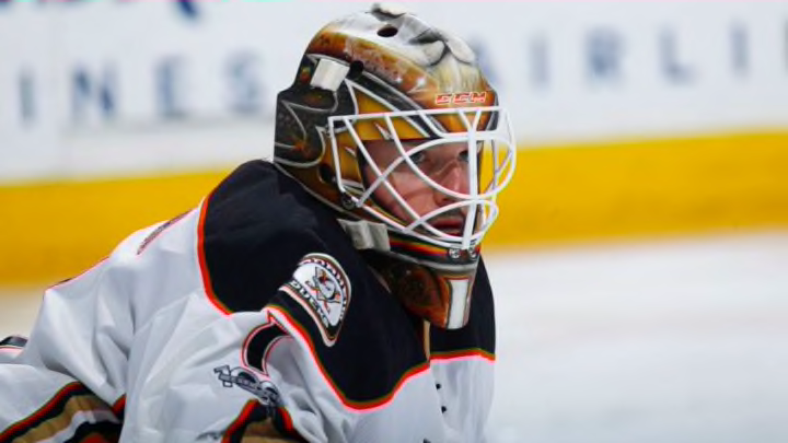
Jonathan Bernier only spent one short season with the Anaheim Ducks. Nevertheless, his mask stands out as a fan favorite in more recent years.
Welcome back to another Mask Monday here at Pucks of A Feather! Today we are going to be taking a look at the mask Jonathan Bernier wore during the 2016-2017 season in his one year stint with the Anaheim Ducks.
Overall Design: Ducks Battlefront v2
Like our first entrant, Frederik Andersen, Bernier is a Dave Gunnarsson (DaveArt) client and has been for over a decade. The design is straightforward and like Andersen’s, a fairly simple design.
It has two Webbed D logos on the cheeks with Mighty Ducks logos scattered throughout. On the forehead sits the face of a lion, a re-occurring image Bernier has made staple on the majority of his masks throughout his career. Lastly, the Anaheim Ducks Wordmark can be seen above the lion’s face.
Bernier wore two variations of this design but for the sake of choosing which one I liked more, the Ducks Battlefront v2 takes the cake. The Webbed D logo just works with the shape of the mask a little better than the Mighty Ducks logos.
Dave did a good job with the mirroring of the logos. They point downwards at a slant and meet at the middle of the chin. I don’t know if it was done on purpose but the bottoms of the Webbed D’s look like the pipping of the jerseys around the collar and shoulder area. I’d assume it was colored that way on purpose but if not, it’s still a cool little detail.
How it Meshes With the Uniform
Unlike Andersen, I really liked Bernier’s set up. I’m not a huge CCM fan, but the goalie world has been blessed with gorgeous E-Flex 3 and E-Flex 4 setups alike the past couple seasons. Bernier kept it fairly simple using our primary colors somewhat sparingly.
With that being said, I liked how he had a pattern of orange, black, orange, black from head to toe. The orange from the mask is eye-catching but not too bright, contrasting well with both the black home jerseys and white aways.
More from Ducks News
- Who could the Anaheim Ducks consider presenting offer sheets to?
- Is Pierre-Luc Dubois on the cards for the rebuilding Anaheim Ducks?
- Making the case for the Anaheim Ducks to trade with the Edmonton Oilers
- Anaheim Ducks might benefit tremendously by trading John Gibson
- How close are the Anaheim Ducks to becoming contenders again?
Finally, the stripes on the pads looked great when Bernier would be down in the butterfly. The orange and gold would sit closer to the pants while the two black stripes would be closer to the ice. I think that’s another thing done on purpose in my opinion.
There’s this phenomenon of using black pads, sticks, tape, etc. that goalies are doing to possibly try and hide the puck better. Personally, I don’t think it works but to each their own.
Extra Tidbits and Reoccurring Themes
The only thing left to mention is the lion’s face that I alluded to earlier. Bernier has incorporated the lion into every one of his masks since his time with the Los Angeles Kings. It comes down to the simple fact that he’s a Leo. He even has the lion tattooed on one of his arms.
Basically, the Lion in astrology signifies being the strong and courageous “ruler” of your life. It makes sense as to why the lion would mean so much to a goalie. We’re supposed to be strong and fearless, up to any challenge regardless of the circumstances in front of us.
It’s cool that Bernier has been able to make a habit of using the same imagery through his career, but then again, it makes sense as we goalies are creatures of habit and when something works, you have to stick with it.
We hope you enjoyed this week’s edition of Mask Mondays! Let us know which mask you think Jake should tackle analyzing next!
